Name: Sophia Irvine-Fortescue Candidate Number: 3825 Centre Number: 69559

Final Cut - Take Me To Church Music Video


Final Album Advertisement


Having received audience feedback about the mock up of my album advertisement and reviewed my rough edit, I have made some changes and this is now what my final album advertisement looks like. It promotes Sofia Karlberg as an artist and the new album 'Cover To Cover.'

Final Digipak Design


Above is the final version of my digipak design. This is a birds eye view of it and if I was to print it out and fold it along the lines, the photos would all face the right way and be the right size. Having received audience feedback about the mock up of it, I made quite a lot of changes which I think have been effective and successful. Overall I am pleased with how it looks and believe that it clearly presents all of the necessary information to the viewer in a visually exciting way.


This is the final version of my digipak placed onto the template that I used to size and shape the panels. This presents an idea of dimensions and also shows the basic framework that I used to help me during the process of completing this.

Wednesday 9 March 2016

Different Media Technologies

This video evaluates several types of media technology that I used during the construction, research and planning and evaluation of my work.


Making use of different media technologies has been important for me developing the skills that I already have, as well as learning new skills. I have learnt how to use new tools on Photoshop that I should be able to use again in the future and also experimented with new templates on Prezi, which I had not done before. Learning new skills on Photoshop enabled me to edit some of my photos in a way that I did not know could be done, so my digipak looks even better than I thought, as it includes many different elements. For example, I learnt how to posturize a photo as well as layer a photo on top of another photo. Doing all of this helped my work to look better as I grew more confident doing things. Not only this, but using these different technologies meant that my work could look different and visually exciting for the most part. I learnt how to use Go Animate which is an interesting and different way to present information in an animated way, and I found it a memorable way to do so.

Tuesday 1 March 2016

Audience Feedback About My Video

In order to gain further audience feedback about my music video, I posted my video to Facebook and received many likes and quite a few comments. I posted my video in the afternoon, when I could see that lots of my friends were online. This was done deliberately so that I would receive instant responses, and this was exactly what happened. I also asked some specific friends to comment as they do media and can give good feedback with more technical terminology, which they did. While my video got a lot of likes which is positive to see, I know that not everyone who liked my video watched it until the end, because of the number of views on YouTube. While it would have been good to have some more feedback, the feedback that I did receive on Facebook was a mixture with mostly good feedback.


To obtain further feedback about my video, I also asked a few member of my media class to comment on it. Their responses are shown below and each of them discuss different things that they either liked or disliked about it.


All of this feedback has enabled me to see what my audience members either liked or disliked about my music video. For the most part my feedback was positive and so I think that my video was well received in the way that I intended it to be, by my audience members. This means that I personally feel that my music video was a success. Looking at my feedback there could perhaps be one or two small tweaks made to it, but overall I am pleased with it. For work in the future, I have learnt and understood that my planning and research is crucial. If I had not done it so thoroughly for my music video, my audience feedback would not reflect my music video in the good way that it does.

Monday 29 February 2016

Links Between My Main Product And Ancillary Texts


It is important to cross media market and promote related articles and objects to the target audience in this way, so that they are recognisable and can be associated with one another. If a customer buys the poster because they like it, then they will see that the digipak is designed to look similar and buy it as well. This makes the company money and at the same time promotes the artist. In a similar way, someone might watch the music video and like the visuals expressed in the shots, then while shopping, see the digipak with similar shots on it and end up buying it because they realise it is by the same artist. Cross-media marketing is a form of cross-promotion and is used by companies globally to deliberately surpass traditional advertisement techniques and instead includes extra appeals to the products they offer, showing how the items on sale are all part of one package; if you have one you must have the other.

Saturday 27 February 2016

How My Media Product Uses, Develops Or Challenges Forms And Conventions Of Real Media Products

Below is an art of the title grid of three photos by three photos. I took nine screenshots of my music video and put them together in order to create nine different tiles. They are numbered one to nine, and below is an explanation for each about how my music video either uses, develops or challenges forms and conventions of real media products.


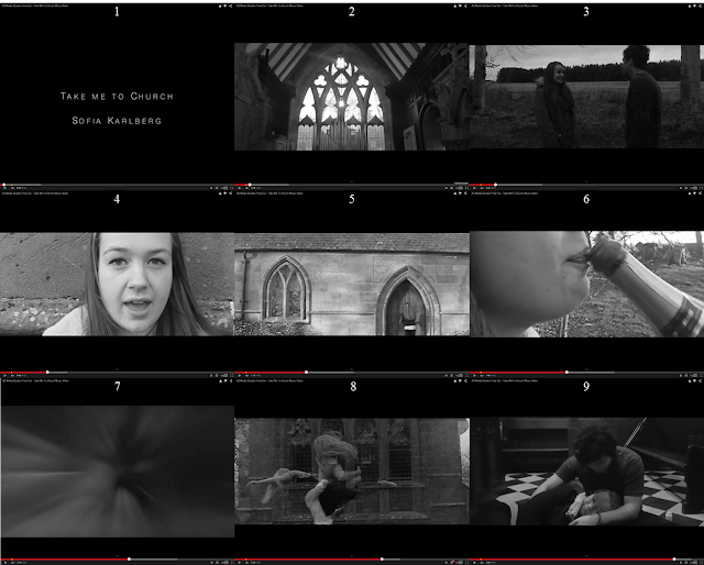
Screen Shot 1 - It is rare to see a music video from this genre that begins with introducing the artist and the name of the song. It does happen, but with a small minority of soul music videos. I would therefore say that I developed this trait and chose take influences from the minority of soul music videos that do begin this way, as well as influences from music videos from different genres. This is because I wanted my audience to know immediately who is singing the song and what the song is called, as this would help to promote my artist. I chose to use the original music video by Hoizer as inspiration and went with a black and white colour scheme for the typography.

Screen Shot 2 - I also made use of a black and white filter over my footage in order to make use of real media products, as many soul music videos have coloured filters. A black and white filter also matches the typography that I chose to use, and is also lifted directly from Hozier's official music video for this song (shown by the three screenshots below). Establishing a location is commonly seen in this genre of music video. This is done very early on in my music video, and the symbolic nature of this shot reflects the lyrics of the song.


Screen Shot 3 - This is a prime example of the two protagonists being introduced. It creates a scenario and begins the narrative which follows through to the end of this video. Some soul music videos include a long and intriguing narrative, whilst other simply hint at broken parts of a narrative that never come full circle or finish in a satisfactory way. I chose to conform to the idea of using a narrative. I decided to create a narrative that had a clearly structured beginning, middle and end, whilst displaying the causes and effects of circumstances seen in my music video to help it make sense to the audience.

Screen Shot 4 - This shot shows the singer's face in a visibly clear way. This conforms to the expectations of soul music, as soul music videos more often than not include a lot of close up shots. Showing the singer's face in this way creates publicity and gives them 'face-time' in their music video, which helps to sell their image and as a result sell their music too. As with all music videos, I used lip-syncing and this is a good example of a moment when lip syncing was successfully used in my music video in a realistic and believable way.

Screen Shot 5 - This shot is a prime example of how my music video makes use of the conventions of real media products, because of the type of shot. In many music videos that fall into the genre of soul music, there are often a lot of mid shots. This is demonstrated in the screenshots below from John Legend's music video 'You & I'. This is because these types of shots are good for establishing location, showing what characters are involved, types of costume, as well as even the time of day. They are used a lot because of how informative this type of shot can be. Looking at the shot from my music video, the protagonist enters the shot and runs to the door of the church, wearing casual everyday clothes; as her shadow is previously cast onto the wall, the audience knows that it is during the daytime as intended.


Screen Shot 6 - This shot goes against and challenges the conventions of music videos for soul music, because extreme close ups are not used in soul music videos. However, I deliberating chose to use this shot as it supported the narrative and with the other extreme close up shots, suggests a passage of time which is what I intended.

Screen Shot 7 - This is an example of how I went against the form of soul music videos. I have yet to see a soul music video which includes special effects like this one. However, for the purpose indicating a clear change in time, I needed to use an effect that was obvious and clearly indicated to my audience that a flashback was occurring or had just occurred. Therefore, while it does not conform to typical music videos from this genre, it was a necessary thing to include so that my narrative could be followed more easily and made sense.

Screen Shot 8 - In many music videos nowadays there are often dance routines. In soul music videos occasionally large group dances will be seen. I developed this convention and chose to include a duet between a male and female dancer. I wanted their dancing to reflect the emotions between my male and female actor, and I think that this is done successfully. I chose a specific part of the song where the music changes, to show a change from the normal narrative to the dance section. This way the change of people onscreen could be better justified and make more sense to my audience. Below are three gifs from recent music videos by Taylor Swift and Justen Bieber showing how different dance routines can be.

 
Screen Shot 9 - This shot develops conventions of real soul music videos, because it is a moment in my music video that creates suspense and builds tension. The audience does not yet know if Zina will wake up or not and this intrigues them. Instead of ending in a simple way (I do have a clearly structured ending) I developed this so that the ending can be interpreted by my audience and made into what they want to believe.


Wednesday 24 February 2016

Final Album Advertisement


Having received audience feedback about the mock up of my album advertisement and reviewed my rough edit, I have made some changes and this is now what my final album advertisement looks like. It promotes Sofia Karlberg as an artist and the new album 'Cover To Cover.'

Tuesday 23 February 2016

Rough Album Advertisement


This is what the rough edit of my album advertisement looks like. I have reviewed it and still wish to make some changes. I need to add a release date and think that the text beginning 'The debut album...' needs to brightened a little bit so that it stands out more. I am also going to darken the scanner tag, because it looks very stark and obvious against the dimmer background. Otherwise, I am pleased with how this looks and am happy with how it has turned out.

Audience Feedback On Mock Up Album Advertisement


Mock Up Album Advertisement


This is the mock up of my album advertisement, promoting the artist and album. It also demonstrates where the song is available online and has a QR code too. I will gain audience feedback from this mock up and then go on to make some changes before creating my final advertisement.

Sunday 21 February 2016

Flat Plan Of My Advert

This is the flat plan of my digipak, and shows where I am planning to place text and photos on my advert. Once I receive feedback, this may change, but I think that the font style and images that I plan to use will work well and compliment one another. Using a QR code is necessary because almost everyone has a smartphone nowadays that they can use to scan the code. I have looked into where Sofia Karlberg's music is available, and I have found that not all of it is available on iTunes. However, all of her songs are available on YouTube, Deezer and TuneIn, as shown below by my search results on goggle, so I have chosen to make use of these three logos on my advertisement.


Saturday 20 February 2016

Copy Of Existing Advert

Below is the copy of an already existing poster, that I made using Photoshop. As I created an existing digipak for Rihanna, I chose to also recreate an existing poster based on Rihanna. There are also three screenshots showing what I did using Photoshop. I used the original poster photo which I found on Google, and made the background black so that the photo fit an A4 sheet of paper. I then added the text after exploring the different font style options. After this I found the logos used on the original poster on Google and added them to my version of the poster. I am not sure if I got the positioning exactly right, but overall I am pleased with how much this replica resembles the real thing, and think that creating this has increased my confidence using Photoshop.


The Conventions Of CD Advertising


The Importance Of A Printed Advert


Even in today’s world where modern technology plays a big part in circulating news and other data, printing is still an important method of advertising. People tend to have a natural attraction to newspapers and magazines, including relevant advertising pieces that they are able to cut out and keep for later to read at their own leisure. Printed adverts are also perceived by readers as being more credible, especially in familiar publications. This is why it is so important for artists and their music.

Highly Informative
In advertising, the printed word can be highly informative, especially when compared to the brief messages of television and radio. In advertising, a small company has the ability to explain all of the features and benefits of its product in a one-page magazine or newspaper advert. This is great for artists and their music, because it enables the consumer to obtain all relevant information in a visually exciting way. Through print media, artists can create a widespread brochure, or even a sales kit. This could include a business card, free tickets, a colourful poster; all of which can be enclosed in a printed sales folder.

Lasts Longer
Small companies using print in advertising can expect their messages to last longer. This is good for artists and their music, because magazines and newspapers are passed around to other readers. This helps to spread awareness of an artist and any upcoming album releases or concerts. Magazine and newspaper publishers keep both circulation and readership figures on their publications. A consumer may keep an artist's perfume sample or advertisement that they received in the post for weeks before acting on it. Promotional items like bumper stickers, pens, charity bands, and refrigerator magnets make for advertising that delivers a lasting message.


 Building An Image
It is important for an artist to use printing in advertising to build a memorable and interesting image. Colour schemes, font styles and pictures are all taken into consideration and effect a consumer’s perception of the artist and their music which is being advertised. A company or product logo is the consummate image builder for a business, and should appear on all printed material.

Considerations
Artists can also better target and position their adverts through the use of print. Many older readers also actually prefer to read the printed versions of newspapers and magazines. Most print advertisers allow companies to position their adverts where they want, so this means that an artist can consciously choose to place their advert next to relevant articles and fit it in with the context of the existing articles.

Friday 19 February 2016

Final Digipak Design


Above is the final version of my digipak design. This is a birds eye view of it and if I was to print it out and fold it along the lines, the photos would all face the right way and be the right size. Having received audience feedback about the mock up of it, I made quite a lot of changes which I think have been effective and successful. Overall I am pleased with how it looks and believe that it clearly presents all of the necessary information to the viewer in a visually exciting way.


This is the final version of my digipak placed onto the template that I used to size and shape the panels. This presents an idea of dimensions and also shows the basic framework that I used to help me during the process of completing this.

Wednesday 17 February 2016

Mock Up Digipak Design


This is a mock up of my final digipak design which includes all of my own photographs. I found the bar code and official logos online. I think that it is a simple design, but that that it also relatively effective and informative. To improve it in certain ways, I will obtain audience feedback so that I can make some changes for the better.

Sunday 7 February 2016

Flat Plan Of My Digipak

This is a photograph of the flat plan of my digipak. I have shown where I intend to place text and what different images I hope to use. I will experiment with filters and effects on Photoshop, and hopefully produce something that I am pleased with and that uses my planning successfully. 
 

Saturday 6 February 2016

How The Sales Of CDs Have Changed


Copy Of Existing Digipak

Below is the copy of an existing digipak that I made, based on Rihanna's album 'Loud.' One photo shows the copy that I without the template that I used, and the other shows the template that I used, giving size and dimensions. I used Photoshop to create the copy of an existing digipak, and found photos on Goggle that are used on the real front and back cover as well as inside, and used them to  create my copy. The two panels on the left show the front and back of the CD, as in the original digipak this is a clear plastic CD holder that folds out as part of the digipak. Sizing the photos and cropping them whilst lining up the spines was hard, but overall I am pleased with how this looks and think that this has helped to remind me of and develop the different aspects of Photoshop.


How Star Image Is Used

Photography is an important element when using star image in advertising. The image is what first attracts the viewer and it is also the last thing the viewer usually remembers after turning the page. Advertising images may be used on billboards and in magazines, as well as on posters and flyers. They are also effectively used on the front of digipaks, as demonstrated in the examples below.


Some of these appear more straightforward depictions of the artists, while others have more dramatic effects and enhancements incorporated. Looking at these covers of soul music albums, I am able to see that I must include the face of my artist on the front cover of my digipak, in order to conform to the genre expectation. Applying a filter also seems to be a common trait, so when I use Photoshop I will need to experiment with this. As three out of the five covers shown above have very close up photos of the artist's faces, I will consider taking photos from different angles of my artist, which are close up and clearly show her face. 

Friday 5 February 2016

Difference Between Digipaks And CD Cases

Digipaks


Digipaks typically consist of paperboard or card stock outer binding, with one or more plastic trays capable of holding a CD or DVD attached to the inside (sometimes the disc tray can become detached after time). A digipak with a recycled tray made from sugarcane can help to reduce environmental impact, and many printers use recycled or sustainable material for the board stock of a digipak.
The popularity of digipaks among record labels and recording artists grew in the early 2000s. Digipak-style packaging is often used for CD singles or special editions of CD albums.
A digipak is less resistant to abrasion than jewel CD cases, so tends to show signs of wear relatively quickly.  It is less vulnerable to cracking than a jewel case is, but the disc tray inside the package remains rather brittle and is prone to cracking if the package is crushed.

CD Cases


 The CD jewel case has a tight and firm grip of the CD because of the tray's lock, so that even if the CD jewel case is turned upside-down, left, or right, the CD is held in place. The jewel case is made of plastic, so it is sturdier compared to cardboard, paper, or foams.
 As the CD jewel case is the standard, most-commonly used CD case, it is cheaper to produce and can easily be mass produced. It is designed to carry a booklet, as well as to have panel inserts. These may be used to display album artwork, lyrics, photos, thank-you notes, messages, biography and other such elements.
The type of material that the CD jewel case is made of, allows storage of CDs for decades without ruining the CDs themselves. The CD jewel case also offers orderliness when stacked on a shelf. Since the CD jewel case has existed for decades, there are many CD shelves, racks, and other products in the market that are made for CD jewel cases.

What I need to do and include when designing my own digipak:

  1. Create six panels with a clear yet sophisticated design.
  2. Make sure that the digipak has relevant pictures to do with my music video.
  3. Have at least one photo of my main character presented on my digipak.
  4. Display the artists name and the title of the album.
  5. Make sure a track list is included as well as a disk holder.
  6. The record company, copyright discloser and barcode also need to be included.

Font Tests For My Digipak And Advertisement

Below are ten different types of font styles that I could potentially use on the cover of my digipak, as well as on my poster. From this list of ten, I have chosen to more closely look at styles two, six, eight and nine and decide which one I want to use.


I like the spacing between letters with this style of font, and think that the fact that the name of the artist is capitalised is more effective and makes a better statement than if it was lowercase. I like this style of font because it makes a statement but also has a sense of elegance about it.

This is a nice style of font, but I think that the boldness of the text could potentially be too harsh for the look I want to obtain. Combining this with the little spacing between letters, although I like this font, I am not sure that I want to use it on my final products.

This is a nice style of font and I like how the letters extend in length and are not very wide. I think that it looks good capitalised, but perhaps it is not quite as sophisticated as I want it to look. It may look better with more spacing between the letters, but as I do not like the letter 'R' in this style of font, so I'm not sure that I want to use it.

I like this style of font with the double lines and the shadows that this creates on each letter. However, although it is the same black colour as the other fonts, it appears much paler than the others. For this reason, while I think that it is elegant and sophisticated I find it perhaps too pale for use on my digipak or advertisement.

Wednesday 3 February 2016

How Musicians Promote Themselves

It is important for successful marketing and advertising to know how to give your artist and album a look. This look is the first thing people see before they hear the song, and with social media these day it is very easy to see the advert before hearing the song. Making use of social media will help to entice people to listen to the music produced by the artist, and increase audience awareness.


Monday 1 February 2016

First Cut - Take Me To Church Music Video


This is the first cut of my music video and looking at it now there are still several things that I want to adjust and change. Although editing has been a challenge, having had to start editing again and never having used Final Cut Pro before, I am pleased with how this first cut has turned out. I still have to fix a moment or two of lip-syncing and want to adjust my title and remove the end credits.

Friday 29 January 2016

Editing My Music Video


This screenshot shows how I decided to present the title in the final cut of my music video. I wanted the name of the song to appear before the name of the singer, especially as it is a cover. I like how the letters blur both before they appear and disappear. It is a nice way to transition into the next shot, and I think that it works nicely with the style of font that I have chosen to use.


This screenshot shows the first moment of lip-syncing in my music video. Editing this was challenging because I had to make sure that it was precisely in time, but it was so easy to be out by only one or two frames. This was frustrating, but the more I worked on fitting the filmed work with the audio soundtrack, the easier it became to do.


This screenshot shows the transition that I finally decided to use to show a change between present and past events. This effect is called a "zoom and pan" and I use it more than once in the final cut of my music video. Experimenting with other transitions as I edited my footage, I realised that I also liked the "zoom" but think it looked better with a "pan" as well. The radial transition effect distorted my footage too much, so this is another reason that I chose the transition that I did.


This screenshot shows me working out how to adjust the opacity of the shots on Final Cut Pro. I wanted to overlay the footage of my dancers, and so to do this I had to lower the opacity of one piece of the footage before putting it on top of another piece of footage. This was relatively easy to do, I just had to experiment with how opaque I wanted different moments of the dance to be. I found that once or twice the footage looked too faint, so I increased the opacity, but then I also had to decrease the opacity if one of the shots looked to intense in comparison to the other.

Thursday 28 January 2016

Rough Cut - Take Me To Church Music Video


This is the first rough cut of my music video. I have used Adobe Premiere Elements 9 to complete it, however unfortunately during the process of rendering my work it appears that the file has become corrupted. This means that the quality is not very good and that there are shaky movements with the camera which should not be there and are not there in my original footage. I am please with the filters and effects, but after speaking to my teacher and trying different solutions, it looks as though I am going to have to restart editing from scratch. This is upsetting as I have worked really hard on this first edit, and it is very frustrating as there is nothing I can do about it. Still, plus et en vous, is my school motto and I love a challenge!

Thoughts On Filming


Wednesday 27 January 2016

Filming My Music Video

These photos show me filming on different days in different locations. I tried to use a variety of shots as planned, and made sure to follow my story board carefully as I filmed each scene. I did make use of the tripod borrowed from the media department, but I also hand held the camera to experiment with what looked better for different parts of my video.  

The photo above shows me at the entrance to the grave yard and how I used the wall to my advantage, balancing the camera on it and angling it to ensure that I filmed the shot that I wanted with the gate.

The photo above shows me standing on a low wall to get the birds eye view shot that was part of my storyboard. I had to hand hold the camera as there was no way that I could use the tripod without ground to place it on.

The photo above shows me adjusting the height of the tripod outside the little church. Even with the legs of the tripod fully extended it was still not quite tall enough for my intended shot, so I had to make it a little higher adjusting and extending the stand.

The photo above shows me inside the Michael Kirk adjusting the angle of the camera on the tripod. The floor was tiled and so provided a nice smooth base, so the camera was level and not at all uneven when filming which was good.


The photo above shows me making use of another hand held shot inside the little church. As it got darker inside the Michael Kirk, I had to turn on the lights for parts of my filming so that it was not too dark. This added a nice warmth to some of my shots which worked well.